← Back to selected work

Lowe’s · Enterprise commerce

Approving purchases

Simplifying purchase requests and approvals for business customers, with clearer states and faster decisions.

Lowe’s · Mobile commerceLowe’s purchase approval mobile interface01
Project date
May 2022
Platform
Android / iOS App
My role
Product Designer
Design tools
Figma · FigJam
UX deliverables
Research findings · Interviews · Scenarios · User journey · Site map · User flow · Persona · Usability testing · Wireframes · Low- and high-fidelity prototypes

01 · Overview

Giving business teams a clearer way to approve purchases.

The Lowe’s app brings inventory, order tracking, favorites, and loyalty benefits together for home-improvement customers and professionals.

The Buyer/Admin Purchase Request Flow focused on a specific moment: a buyer exceeds their company’s purchase limit and needs an administrator to review the order. The work connected commerce, loyalty, communications, and app teams around a centralized approvals experience.

Lowe’s Purchase Request case study introduction
Lowe’s purchase request mobile experience

02 · Definition

Requirements & scope

The problem

Administrators could not receive and act on purchase requests quickly enough.

The existing experience lacked timely notifications and a streamlined approval workflow. Delayed or unclear decisions slowed purchasing, disrupted business operations, and created frustration for both requestors and administrators.

UserOrganization administrators managing approvalsNeedPrompt alerts and immediate approve or deny actionsProblemCurrent process is not seamless; it may be delayed, unclear, or cumbersome.ImpactSlower approvals → delays in purchasing → possible business disruptions or frustration for requestors and admins.
Business Requirements

Acceptance criteria

When a buyer submits a purchase request, the app sends a push notification to organization administrators and directs them to the Purchase Approvals List.

  • The Purchase Approvals List shows all purchase requests and their current status, with options to sort and filter the list.
  • Purchase requests with a pending approval status display simple Approve and Deny calls to action.
  • The feature focuses on the administrator experience: receiving a notification for a pending purchase request and being able to approve or deny it easily.
Nice to have

Faster entry points

  • Surface pending approvals on the home page.
  • Take users directly from a push notification to an individual request.
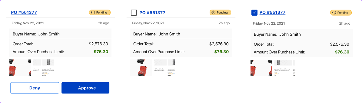
  • Create a focused component for acting on a single purchase request.
Out of scope

Keep the release focused

  • Completing the buyer’s final purchase after approval.
  • Broader exploration outside the approval and denial journey.
  • Unrelated changes to commerce, loyalty, or account management.

My role

Lead the experience from problem framing through validation.

Stakeholder and user interviewsPersonas, scenarios, and journey mappingCompetitive analysis and information architectureLow- and high-fidelity prototypesUsability testing and design iterationDesign QA & Implementation Validation

03 · Mapping

Building a shared view of the journey.

Mapping organized the structure, handoffs, and interactions before screens were designed.

I defined the admin and buyer roles, identified their key tasks, mapped touchpoints and emotional moments, and structured the information architecture around the decisions each person needed to make.

User journey mapping

Understand the experience from the user’s point of view.

  1. Define user personas

    Clearly define the user personas based on research and data.

  2. Identify key tasks

    List the key tasks and goals each persona needs to achieve within the product.

  3. Visualize the journey

    Create journey maps that illustrate the steps users take, including interactions, touchpoints, and pain points.

  4. Highlight emotions

    Note the user’s emotional state at each stage to understand frustrations and satisfaction levels.

Information architecture (IA) mapping

Give content and navigation a clear structure.

  1. Content inventory

    Compile a comprehensive list of all the content and features included in the product.

  2. Organize hierarchically

    Structure the content into a hierarchy that shows the relationships between sections and pages.

  3. Create the sitemap

    Develop a sitemap that represents the content organization, navigation paths, and overall structure of the website or application.

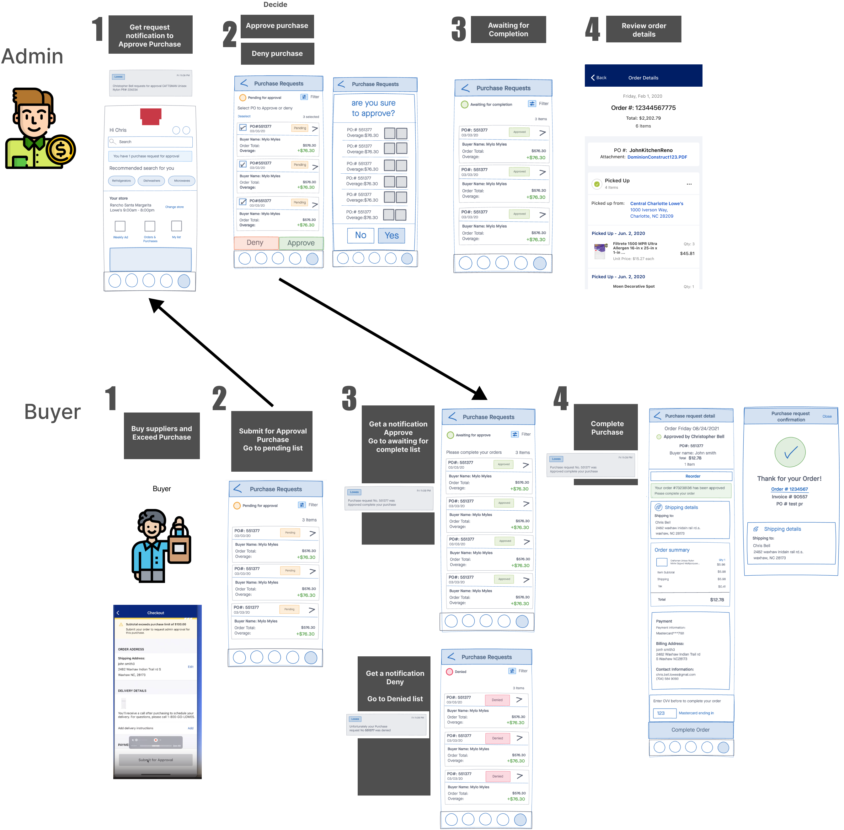
Early administrator and buyer journey sketch

Audit & analysis

Adapting the desktop experience for mobile.

Reviewing the existing desktop flow revealed issues with selection visibility, action feedback, filtering, and the meaning of purchase overages. These findings became the first set of design opportunities.

Existing Lowe’s desktop purchase approval experience
Detailed audit of the existing purchase request screen

Audit findings

Areas for Improvement

Checkbox Selection Visibility & Action Clarity

The selection checkbox is small and placed far left, making it easy to overlook. There is no clear call to action (CTA) button to confirm approval or denial after selection. A sticky “Approve/Deny” button could improve usability.

No Feedback for Actions

If a user selects “Approve” or “Deny,” there is no confirmation popup or inline feedback. Adding a visual indicator, such as a success checkmark or toast notification, would improve user confidence.

Filter Dropdown Placement & Visibility

The filter dropdown is small and does not stand out. A more prominent placement near the “pending requests” heading would improve usability.

Overage Column Lacks Explanation

The “+$11.78” overage might not be intuitive for all users. Add a tooltip or brief label to clarify its meaning, such as “Amount exceeding budget.”

Recommendations

Enhancements for Better UX

Add Bulk Actions: If multiple requests exist, a “Select All” option would speed up decision-making.

Improve Mobile Responsiveness: Ensure the table layout adapts well to mobile screens with collapsible rows.

Progress Indicators: A loading spinner or progress bar when approving/denying would provide feedback.

Improve Visual Contrast: The gray approval/denial icons are subtle; using bolder colors or buttons could improve accessibility.

Competitive analysis

Patterns that make approval flows faster and more trustworthy.

Leading experiences reduced steps, surfaced progress, supported bulk actions and filters, delivered real-time alerts, and connected approval outcomes directly to purchase completion.

Competitive analysis for purchase approval experiences

Key findings

Competitive Analysis Insights

🛒 1

Buyer Flow Insights

  • Simplicity = Conversion: Brands with fewer steps and clutter in the purchase request process tend to have higher engagement.
  • Clear Progress Indicators: Apps that visually show the steps (e.g., Request → Review → Complete) reduce user anxiety and drop-off.
  • Saved Preferences: Leading apps allow buyers to save past purchase requests, autofill forms, or reuse past info — great for repeat actions.
  • Personalization: Tailored product suggestions during or after the request process increase cross-selling.
🧑‍💼 2

Admin Flow Insights

  • Bulk Actions & Filters: Strong platforms allow admins to approve, reject, or modify multiple requests quickly, often with advanced filters.
  • Real-Time Notifications: Instant alerts for new requests or required approvals streamline decision-making.
  • Audit Trail / Logs: Apps with transparency features (who approved what, when) provide trust and accountability.
  • Role-Based Permissions: Top apps let admins define different roles (e.g., buyer, approver, finance) to streamline workflow.
✅ 3

Purchase Completion Insights

  • Confirmation + Next Steps: A clear confirmation screen with “what happens next” messaging improves trust.
  • Order Tracking Integration: Competitive brands often link request approval directly to order tracking and delivery status.
  • Mobile-Optimized Feedback Loop: After completion, apps may prompt users for feedback or show “you may also like” sections to keep engagement going.
  • Support Access: Easy access to customer service (chat/help button) post-purchase builds confidence.

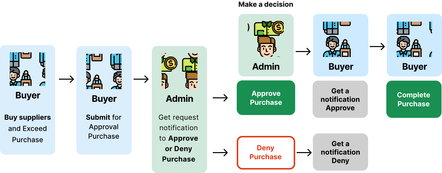
Buyer + Admin · Make a decision

What are the steps the users need to take to achieve this goal?

Buyer and administrator purchase approval flow

Experience goals

Customer Experience Goals

By focusing on the following customer experience goals, the organization can create a positive experience for internal buyers—fostering efficiency, transparency, and satisfaction throughout the purchase request approval process.

01

Transparency

Give internal buyers visibility into the status of their purchase requests so they remain informed throughout the approval process.

02

Efficiency

Streamline approvals through push notifications and a centralized Purchase Approvals List, reducing the time and effort needed to manage requests.

03

Accessibility

Let administrators access and manage approvals across web and mobile platforms so they can take action wherever they are.

04

Simplicity

Offer a clear, intuitive interface with focused options for approving or denying requests, reducing complexity and confusion.

05

Prompt action

Enable administrators to review and act on pending requests quickly, supporting timely responses and overall satisfaction.

Lowe’s supplier and service journey

Audience

Users and Goals

Buyer

Stay within budget and keep work moving.

The buyer needs to understand the company limit, submit an order for approval when necessary, and return to complete the purchase once it is approved.

Administrator

Protect budgets without slowing the team down.

The administrator reviews requests, checks details against organizational policy, and approves or denies spending with confidence.

Administrator persona

Sharon Kuriakose

Procurement Manager · 55 · Kansas City, MO

  • Reviews and prioritizes requests efficiently.
  • Needs quick filters and detailed in-list information.
  • Values auditability, clear labels, and time-saving tools.
  • Feels friction when notifications or batch actions are unclear.
Administrator persona quote
Buyer persona

Carlos Ramirez

Field Operations Coordinator · 43 · Portland, OR

  • Submits requests quickly from active job sites.
  • Needs real-time approval and clear status updates.
  • Expects an easy route back to incomplete orders.
  • Values speed, organized lists, and dependable mobile tools.
Buyer persona quote

04 · Sketching

Exploring both sides of the approval.

Early sketches helped the team examine entry points, onboarding, request statuses, errors, selection patterns, and the handoff back to the buyer before investing in polished UI.

Lowe’s purchase approval wireflows
Administrator flow

From notification to a confident decision.

Sketch exploration

Administrator Sketching Screens

01

Mapping the flow

Once the mapping is synthesized, we can begin considering the screens needed for this flow within the app.

02

Considering entry points

Start with an empty Purchase Requests screen and determine where entry points should live: email, notifications, and the account menu.

03

Onboarding users

Create an onboarding screen that provides administrators with the information they need to understand the experience.

04

Status screens

Explore clear states for pending, approved, and denied purchase requests.

05

Error screens

Consider how the experience communicates and helps users recover from errors.

06

Purchase Request management

Explore how administrators select requests, approve or deny them individually or in bulk, and avoid accidental actions.

Buyer flow

From purchase limit to order completion.

Sketch exploration

Buyer Sketching Screens

01

Mapping the flow

Once the mapping is synthesized, we can begin considering the screens needed for this flow within the app.

02

Considering entry points

Start with an empty Purchase Requests screen and determine where entry points should live: email, notifications, and the account menu.

03

Onboarding users

Create an onboarding screen that provides buyers with the information they need to understand the experience.

04

Status screens

Explore clear states for pending, approved, and denied purchase requests.

05

Error screens

Consider how the experience communicates and helps buyers recover from errors.

06

Buyer completing purchase

Consider the screens and transitions buyers need to return to an approved order and finalize the purchase.

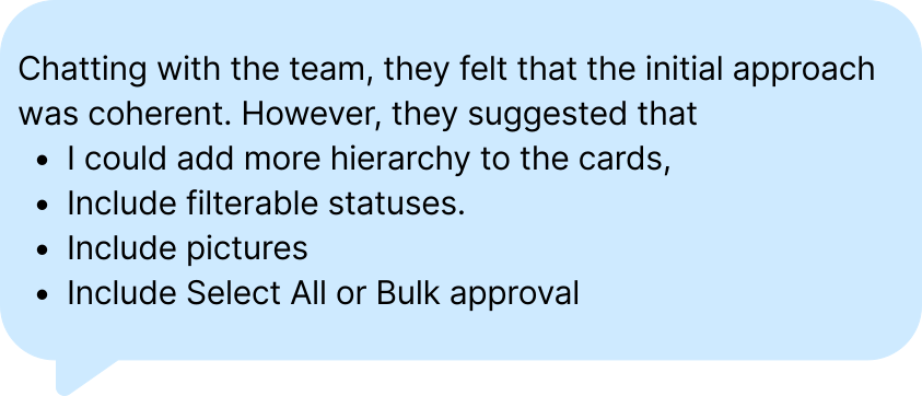
Team feedback

Pressure-testing the flow before prototyping.

05 · Prototyping

Turning the mapped journey into something testable.

Prototypes made the complete handoff tangible and gave the team a fast way to validate assumptions.

Two connected experiences let participants embody both roles: the administrator reviewing the request and the buyer returning to finish an approved order.

Connected prototype

Submit, review, approve, and complete.

After qualitative research, competitive analysis, journey mapping, and team feedback, I brought the two roles together in one testable experience designed to validate the most important assumptions.

06 · Testing

Testing the whole experience, not just individual screens.

Objective

Evaluate clarity and usability across both roles.

Give administrators the ability to accept or reject purchase requests in the app while helping buyers understand what happens before and after approval.

Method

12 unmoderated participants

Six Pro Lowe’s shoppers tested the Buyer prototype and six tested the Administrator prototype, thinking aloud throughout the experience.

Core tasks

Submit → review → approve → complete

Participants submitted a request over a $1,000 limit, acted on the administrator notification, filtered and reviewed requests, then returned as the buyer to finish the order.

Research brief

Testing the end-to-end Purchase Request experience.

The study examined whether buyers and administrators could understand, navigate, and complete a connected approval journey across two prototypes.

Experience in scope
  • Push notification when a purchase request needs attention.
  • A new Purchase Approvals List showing all requests and statuses.
  • Sorting and filtering the list by status.
  • Simple approve and deny actions for administrators.
Participants & setup

Twelve Pro Lowe’s online shoppers participated in an unmoderated UserTesting.com study: six on the Buyer prototype and six on the Administrator prototype. Participants answered questions and thought aloud throughout the experience.

Online shoppersLowe’s customersPro usersBuyer prototypeAdministrator prototype
Scenario

A contractor order exceeds the company’s $1,000 purchase limit.

Imagine you are working on a large contractor project and need to order supplies through your Lowe’s 4 Pros account. As you add items to the cart, the order exceeds the $1,000 limit set by your company’s administrator. You must submit a purchase request for approval.

You will experience this scenario as both the Buyer and the Administrator. The prototype changes the account view to match the active role. Think aloud, provide honest feedback, and answer each question as you complete the journey.

Phase A · Buyer

Submit a purchase request.

You selected your items and discovered that the order exceeds the company limit.

  1. Before clicking anything, scroll through the screen and share your initial thoughts.
  2. What content is surprising, and what content feels missing?
  3. Imagine the estimated total is $1,069, exceeding the $1,000 company purchase limit.
  4. What do you expect will happen after selecting Submit for Approval?
  5. Submit the purchase request and describe how you feel about what was submitted.
  6. What do you think happens next, and what would your next step be?
  7. Select Continue Shopping, remember the next screen, and prepare to switch to the Administrator role.
Phase B · Administrator

Review and approve the request.

The buyer submitted the request, and you received a push notification requiring action.

  1. You receive a push notification asking you to review a pending purchase request. What do you expect to happen when you open it?
  2. Open the notification and talk through what you see.
  3. From the complete Purchase Requests list, show how you would view only pending requests.
  4. Filter by Pending and describe what works or could be improved in the filtering experience.
  5. Select the first pending request. How do you feel about the list view, and did you notice Select All?
  6. Expand the first request to review its details. Would you ever need to edit a purchase request?
  7. Approve the request and describe how intuitive the administrator process has felt so far.
  8. Open the denied requests and think aloud while navigating to them.
  9. Open the account menu. How do you feel about the administrator menu?
  10. Return to Purchase Requests, then go to Shop and review the notification at the top.
  11. How does the in-app notification work alongside the push notification, and what else would make the experience easier?
  12. Rate the overall administrator experience from 1 (poor) to 5 (excellent), and explain your answer.
Phase C · Buyer

Return and complete the purchase.

The request is approved and now has an Awaiting Completion status.

  1. Imagine you receive a notification that the administrator approved your request. Where would you go to finish the order?
  2. Show how you would find a purchase order with the Awaiting Completion status.
  3. Once the Awaiting Completion order is visible, explain what you expect to do next to submit the order.

Research findings

What we learned

Feedback revealed where notification patterns, terminology, status visibility, and the route back to an approved order needed to work harder.

3.67Buyer average
3.50Administrator average
3.58Overall experience

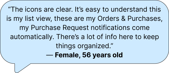
Notifications created the right expectation.

Most participants expected push and in-app notifications to lead directly to purchase requests. Consistent alerts mattered because professional buyers wanted the process to be quick and painless.

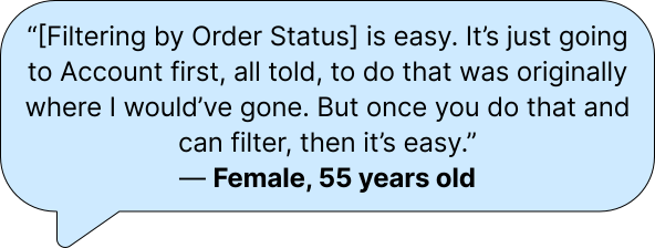
Lists and filters were mostly intuitive.

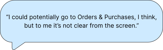
Once users reached Purchase Requests, they understood the filter options. Some participants still struggled to discover the page from Shop and assumed Inbox would be the entry point.

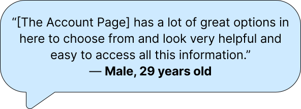
Approve and Deny felt straightforward.

Select All was not prominent enough, and users wanted expandable request details so they could evaluate orders without leaving the list.

Returning to complete an order was harder.

Buyers could finish payment once they found the Awaiting Completion order, but navigating back to it was unclear. Persistent notifications and a Shop-page entry point would help.

Recommendations

Turn the findings into clearer paths and safer actions.

  • Add Purchase Requests beside Orders & Purchases on the Shop page.
  • Add a checkbox beside Select All to improve batch-action discoverability.
  • Provide equally strong notification settings for buyers.
  • Surface Approve and Deny on each order in the list.
  • Simplify filtered-list labels so they do not compete with the Filter control.
  • Make request details expandable without navigating away from the list.

07 · Final design

Refining the experience around user feedback.

The final interactive prototype translated the research into a clearer system of notifications, statuses, filters, request details, and actions.

Iteration focused on helping users always understand whose action was required, what state a request was in, and where to go next.

UI components

A shared language for status and action.

Reusable status treatments, buttons, and progress indicators made the approval model consistent across buyer and administrator journeys.

What’s next

Validate the refined system in a live pilot.

The next steps are to refine the final prototype, prepare the development handoff, and run a pilot with real users to validate the solution in its production context.

Continue exploring

Next case · VerizonBusiness shopping cart